
Product cards have evolved in various ways over the decades. Grocery e-commerce, as a relatively new category, has added complexity to user requirements—shaping what shoppers need to see, understand, and interact with to feel confident in clicking Add to Cart. In being a white-label SaaS platform you run in to the challenge of increased variability not just data sources (and how those are formatted), but with how clients prefer to do business.
A key difference between conventional and grocery e-commerce is cart size. While an Amazon order may include just a few items, grocery orders often exceed 100. This fundamentally alters the traditional “Add to Cart” workflow, requiring shoppers to add items directly from product cards—often with quantity controls. Additionally, grocery deals are far more complex than standard sale prices, varying significantly in type and structure. Because of this, building trust and confidence in a user, ensuring they have all the information they need to purchase a product can be challenging.
Here's a breakdown of all the variability that can be exposed to the front-end in one of our product cards:
* varies with every retailer
As we on-boarded more and more clients (a good thing!) we found that the constraints that were implemented within the initial, inherited product card design were starting to cause issues. Retailers wanted their online experience to mirror in-store shopping and market products similarly.
We understood the problem. And at the same time, we were advocating for users to ensure that our UI evaded the clutter that would have occurred should we have thrown things at the wall to see what sticks.


The sheer amount of information needed in a limited container was unsustainable. Product titles were capped at three lines, yet some retailers included lengthy brand names. Loyalty program indicators were fixed due to marketing requirements, crammed into a small sales ribbon. Deal text for sophisticated retailers was exceeding 30 characters, but the container wasn’t designed to expand since traditional sales text was typically concise. Some retailers even wanted multiple deals to a be applied to a single product (the most we saw was 4!)
On top of that, new requirements for promotional groups and coupon clipping were on the horizon. We needed to adapt—not only to support data variability but also to prepare for future challenges that were sure to arise.
The solution was simple—we needed a dynamic card design. That meant result rows wouldn’t always line up. No big deal, right? Well, we had to make sure it wouldn’t create visual confusion. So, we dug into the data and mapped out the worst-case scenario in an anatomy diagram.

But what about all the variations in data? Well, we checked that as well.Here's what that looks like with real data. Looks delicious!
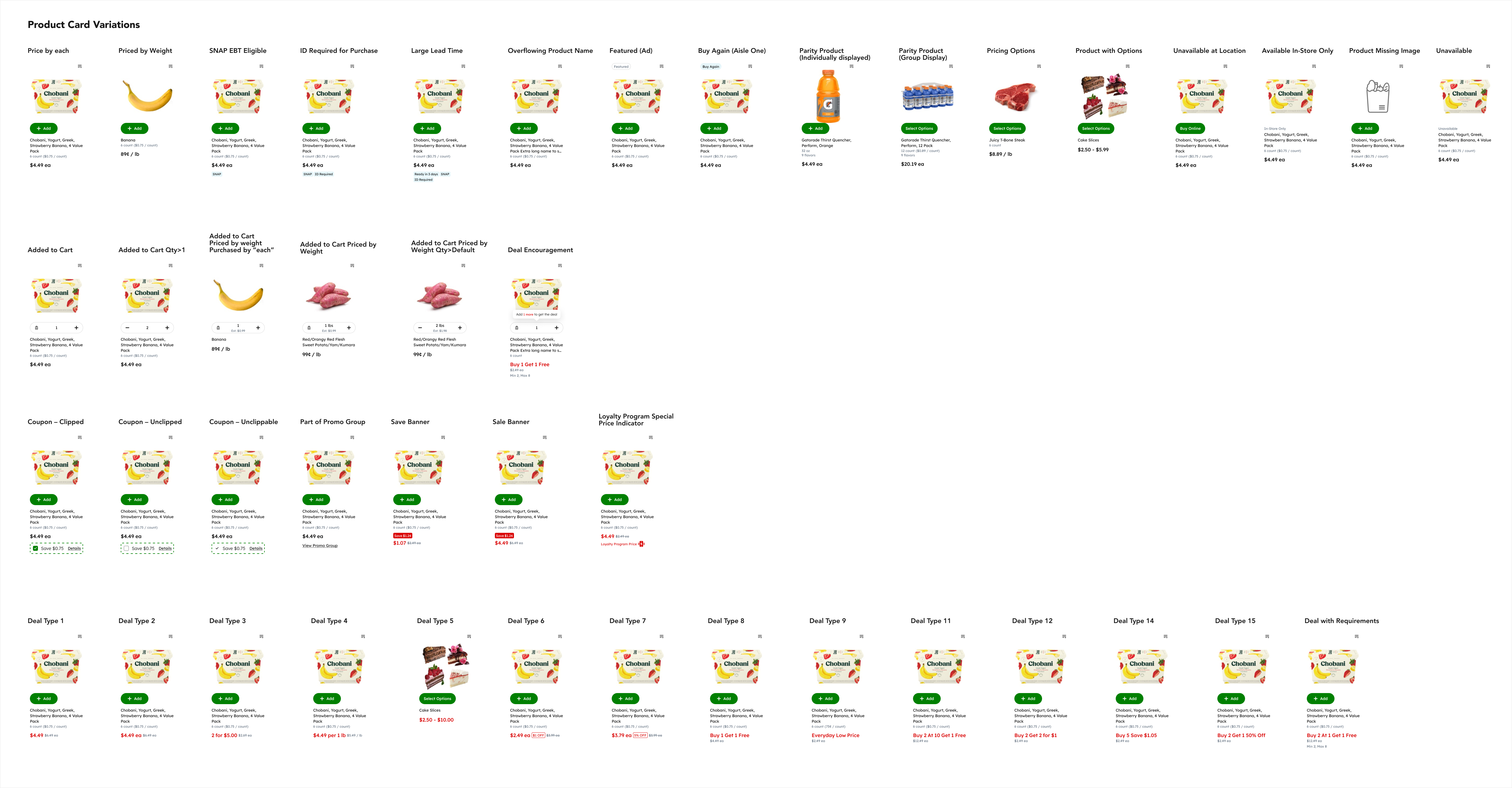
We came up with a product card with dynamic components. The image could scale to any size to handle responsive views and different column counts. Product titles could extend infinitely, deal text could wrap, and product tags (like ID requirements or EBT) weren’t limited. We also shortened the “Add to Cart” button text to reduce clutter and moved it just under the product image. This way, even with varying card heights, everything still felt visually aligned and consistent.
When making any design change, it’s important to consider the bigger picture—and that’s exactly what we wanted to test. So, we created multiple search result views and started user testing on both web and mobile. We asked testers to find products, call out key highlights, and differentiate between similar items. Overall, the feedback was really positive. At that point, we felt confident handing it off to engineering.

